Basic examples
Example 1: Basic charting usage
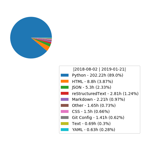
from wakapy import User

user = User('/home/surister/data.json')
chart = user.pie_chart('lan')
# lan = languages. See the different options
# in Day.raw_containers
chart.show()

# Shows the chart.
chart.save('/home/surister/mychart.png')
# Saves the chart to the desired filepath.
output:
Example 2: Date slices in chart
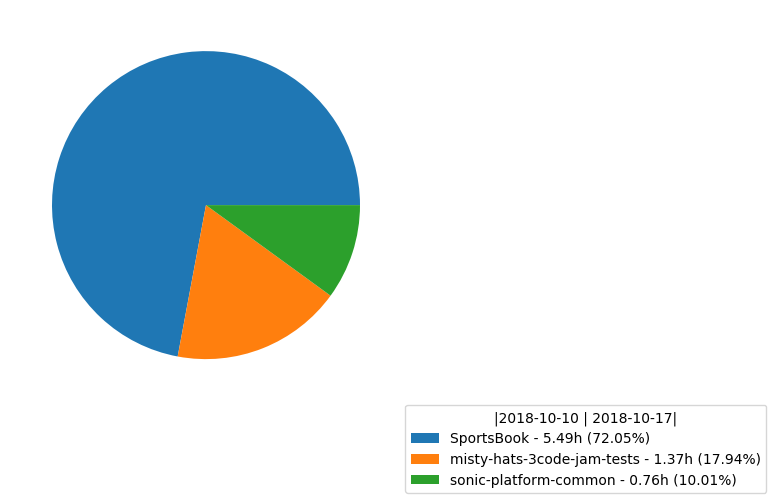
from datetime import date

from wakapy import User

date1 = '2018-10-10'
date2 = date(year=2018, month=10, day=17)
# Dates can either be a str or a datetime.date object.

a = User('/home/surister/info.json')

a_slice = a.get_slice(date1, date2)
# Returns a Slice object containing
# the Days object between the two given dates

chart = a.pie_chart('proj', num=3, sliced=True)
# Num is the number of projets that will be displayed
# Sliced is set to True, so the chart will be created with
# sliced object created before.

chart.save('/home/surister/mychart.png')
output:
Example 3: Creating your own chart
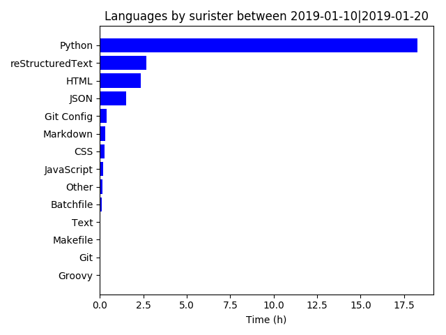
from datetime import date

from wakapy import User

import matplotlib.pyplot as plt
import numpy as np

date1 = date(year=2019, month=1, day=10)
date2 = date(year=2019, month=1, day=20)

user = User('/home/surister/info.json')
user_slice = user.get_slice(date1, date2)

data = user.fetch_data('lan', True)

# You could use the fetch_data function
# or iterate yourself:

data2 = {}
for day in user_slice:
    if not day.is_empty:
        for container in day.container_dict['lan']:
            if container.name not in data2.keys():
                data2[container.name] = container.total_time
            else:
                data2[container.name] += container.total_time

# In this case the same data1 and data2 have the same values.
# Note that fetch_data returns an ordered dict
# while data2 would not be ordered.


fig, ax = plt.subplots()

keys = data.keys()

y_pos = np.arange(len(keys))

hours = list(map(lambda x: round(x / 3600, 2), data.values()))
# We convert the seconds into hours


ax.barh(y_pos, hours, align='center',
        color='blue')
ax.set_yticks(y_pos)
ax.set_yticklabels(keys)
ax.invert_yaxis()  # labels read top-to-bottom
ax.set_xlabel(f'Time (h)')
ax.set_title(f'Languages by {user.username} between {date1}|{date2}')

plt.show()
output:
Note
These examples and images can also be found in the examples folder